Turning Business
Data into
Smart Decisions


Visit Site

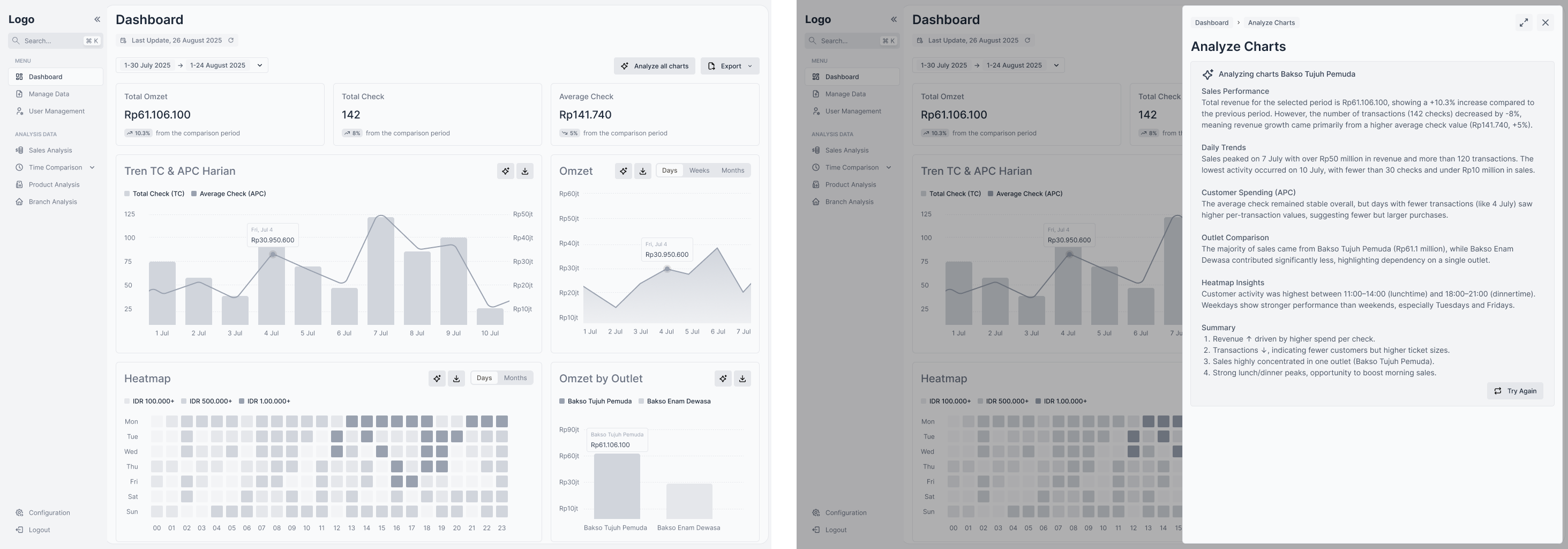
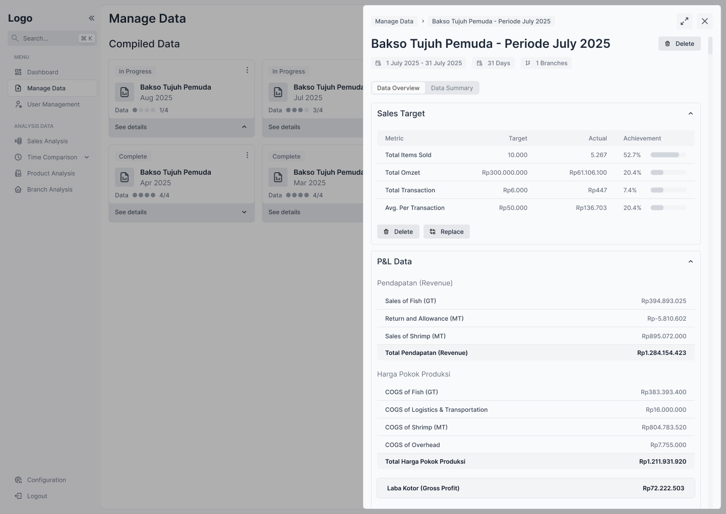
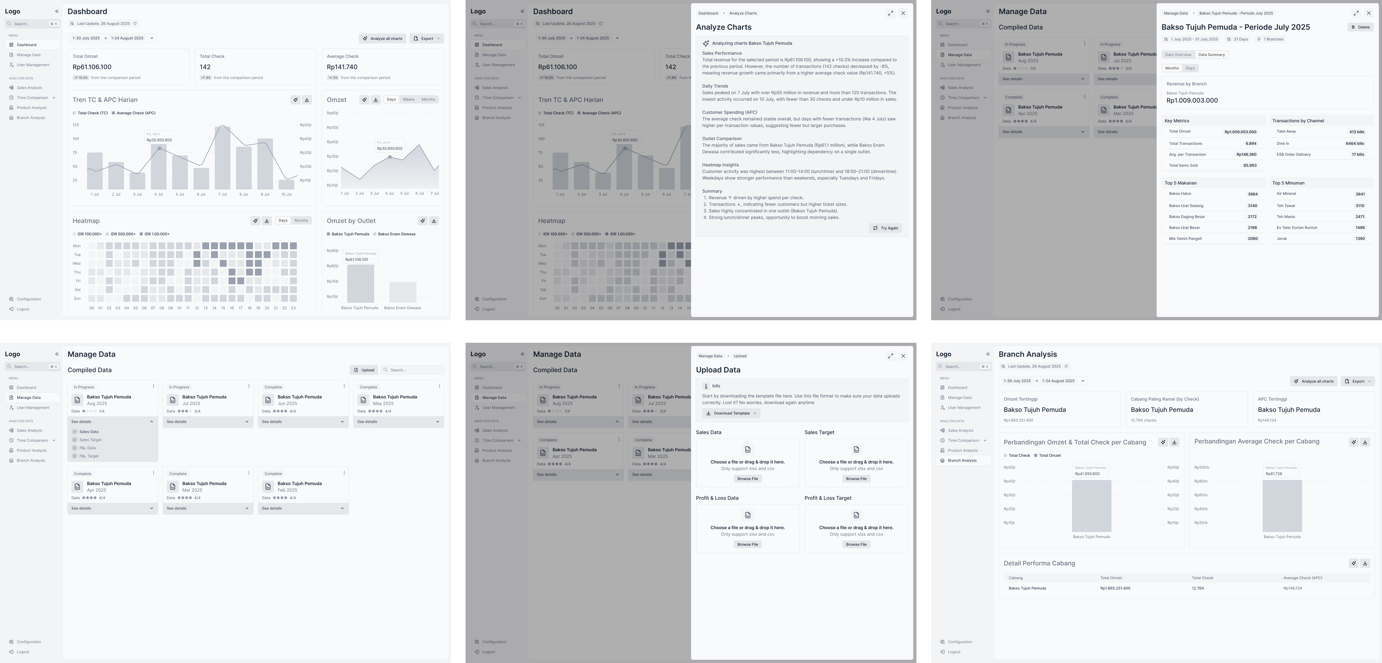
Finalytics is a web-based dashboard that helps business owners understand their financial performance with clarity.

By combining AI-driven analysis and structured data visualization, Finalytics transforms raw P&L and sales target inputs into meaningful insights. The app helps users track sales, profit, and performance across products and branches in a simple and intuitive way.

Many Small Business Owners Struggle to Understand Their Own Numbers

Most small and medium business owners keep track of their finances through spreadsheets or manual records.
They know their revenue and expenses, but they rarely understand what those numbers mean.
There’s often no clear picture of how sales, profits, or branches actually perform over time.

That’s where Finalytics comes in. It is a web-based finance dashboard powered by AI that helps users turn raw data like Profit & Loss (P&L) and sales targets into clear insights, showing trends in sales, products, and branch performance automatically.

I joined this project as a UI/UX Designer, responsible for creating wireframes and refining the dashboard layout to make data visualization simple, structured, and easy to interpret.

My Role

I joined the project as a UI/UX Designer focusing exclusively on wireframing.
My responsibility was to define the structure and flow of the dashboard, ensuring every element supported clear data interpretation and an intuitive user journey.

Building the Foundation: Wireframes

I began by translating the product idea into structured wireframes, defining how users would move between key sections like Sales, Profit & Loss, Products, and Branches.

The wireframes emphasized:
πŸ‘‰ Hierarchy: Important metrics appear above secondary data.
πŸ‘‰ Grouping: Related data sits together for faster scanning.
πŸ‘‰ Scalability: The layout can expand as more insights are added later.

These wireframes became the blueprint that guided the development and visual design phases, ensuring consistency across the product.

Refining the UI Layout

Once the structure was approved, I refined the UI layout to enhance visual rhythm and usability.
My focus was on making every section look intentional, where alignment, spacing, and typography all help users process data faster.

Key improvements included:
πŸ‘‰ Cleaning up chart areas for better focus on insights.
πŸ‘‰ Simplifying navigation to reduce cognitive load.
πŸ‘‰ Creating flexible card layouts that adapt to various data types.

The result was a dashboard that feels organized, modern, and easy to read even when displaying complex datasets.

Landing Page Design

To complement the dashboard, I also worked on the Finalytics landing page. The goal was to clearly communicate the platform’s value and show how AI helps businesses make smarter financial decisions.

The landing page highlights Finalytics as an AI-powered finance insight platform that transforms raw business data into meaningful analysis. It focuses on clarity, trust, and professionalism, ensuring visitors quickly understand what the product does and why it matters.

Deliverables and Outcome

My final deliverables included complete dashboard wireframes and refined UI layout specifications for the design and development teams.

These deliverables helped the team:
πŸ‘‰ Translate abstract business goals into a visual structure.
πŸ‘‰ Maintain consistency across pages and data views.
πŸ‘‰ Establish a scalable foundation for future AI-powered features.

Reflection

Working on Finalytics taught me how powerful information hierarchy can be in shaping how users understand data.
Even without visual polish, well-structured wireframes can define clarity and direction for an entire product.

Through this project, I strengthened my ability to:
πŸ‘‰ Organize dense information into readable layouts.
πŸ‘‰ Create functional wireframes that communicate logic clearly.
πŸ‘‰ Refine interfaces where clarity and precision matter most.

This project reinforced an important principle for me: great design begins with structure. A clean layout doesn’t just make an app look better, it helps users think better.