Many People Struggle to Stay Consistent in Managing Their Finances
Most people start using finance apps with good intentions, but
after a few weeks, they stop. Manually entering every expense
feels repetitive, and the process quickly becomes a chore.
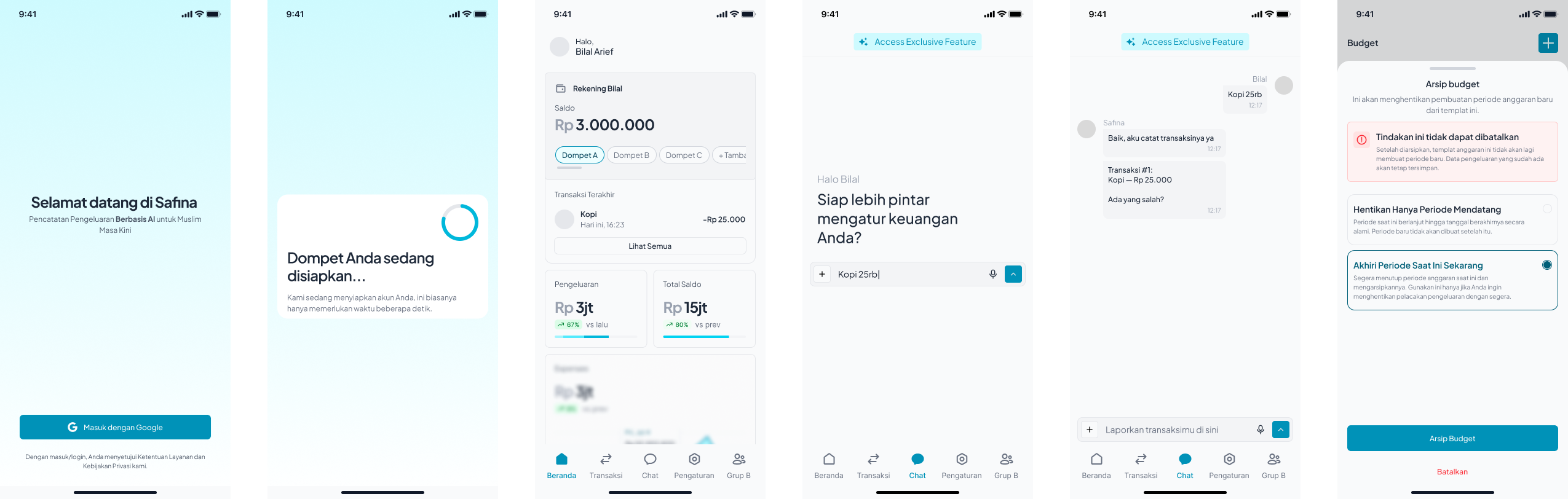
Safina was created to change that habit. This mobile app helps
users track their spending and income through simple
conversations with an AI chatbot. By saying things like
“I spent Rp25.000 on coffee this morning,”
the app automatically records and categorizes the
transaction.
As a UI/UX Designer, my role was to refine the user flow, design
the interface, and ensure that the concept felt simple, natural,
and engaging for everyday use.
Understanding The Problem
Safina’s goal is to make financial management feel effortless. Instead of navigating through multiple forms and buttons, users can communicate directly with the app using everyday language. The challenge was to design this conversational experience while keeping it functional, clear, and enjoyable to use.
Research And Direction
From those insights, I focused on creating an experience that reduces friction, simplifies decision-making, and builds comfort through clarity. This direction guided how I approached the user journey, layout, and visual hierarchy.

Structuring The Experience
Each step was designed to feel continuous, as if the user is in one ongoing conversation rather than switching between different screens. This made the experience smoother and helped maintain a natural rhythm in how users interact with their finances.
Wireframes And Layout Exploration
I experimented with different layouts to make sure the chat interface remained the focal point, with quick access to insights, summaries, and recent transactions. This stage allowed me to confirm the balance between information and simplicity before moving to high-fidelity design.

Visual Design System
Finance can often feel overwhelming, so I aimed to make the
interface look calm and approachable. I used a combination of
soft colors, rounded shapes, and clean typography to build trust
and focus. Spacing and hierarchy were carefully adjusted to make
information easy to scan and understand.
The overall visual direction was designed to give users a sense
of comfort and control, encouraging them to track their finances
regularly.
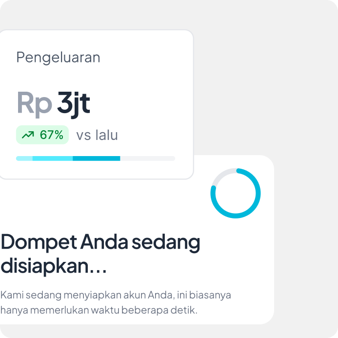
Final Design Overview
Key highlights include:
👉 Conversational input to record expenses or income naturally
👉 A simple dashboard that visualizes spending patterns
👉 Smart categorization powered by AI
👉 A calm and clean interface that supports consistency
This approach makes finance management easier, transforming a routine task into a friendly daily habit.
Designing For AI Conversation
One of the key parts of this project was defining how the app
communicates with users.
I worked on creating conversation patterns that feel natural but
remain clear and functional.
For example: “Kopi 25rb” → “Transaksi #1: Kopi — Rp 25.000 Ada
yang salah?”
By designing these interactions carefully, the chatbot feels both
capable and friendly, guiding users without confusion.

Future Steps
The next planned features include:
👉 Bill scanning to convert receipts into data automatically
👉 Goal tracking to help users plan savings
👉 AI-driven financial insights to give personalized advice
These ideas aim to make Safina more powerful and proactive in supporting users’ financial goals.
Reflection
My main contributions included:
👉 Refining and structuring the user flow
👉 Designing a conversational interface
👉 Building a consistent and calm visual design system
Through this project, I learned how to connect technology, behavior, and emotion in a way that feels seamless for users.